I recently took on the job to refresh the Stanford Alumni Association of Singapore’s webpage. For three-day rushed work, I think it turned out alright… I hear there are problems on IE5, but aghh. Fuck that.
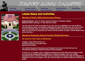
Before:

Not hideous, but not to my liking either. The old designers used frames and had the most annoying machine-coded HTML I’ve ever had to contend with. But the people who hired me just wanted to transplant the old site onto the new server, so less work for me at the time.
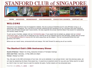
After:

Without mentioning the obvious ripoff of the actual school website’s logo elements (the imitation was specifically requested), the main design elements were adapted from Minima Plus. And now it’s running WordPress 1.5, which makes posting announcements and archival so much easier.
